Technical SEO Secrets
The probability of a consumer bouncing away from a SERP-listed page increases by as much as 123 percent if your platform takes more than six seconds to load on desktop or mobile. Load time and its facets – mobile compatibility and image compression – aren’t traditional search engine optimization (SEO) elements. They’re technical, and they’re essential to the ranking of your platform.
Let’s find out how you can turn the architecture of your platform into another SEO tool.
What Is Technical SEO?
Technical SEO is SEO work that exists outside of the actual content that you produce for your platform. It’s the architecture of your platform – the host you’ve chosen, the images you’ve embedded into your work, and the time it takes your content to load from a search engine results page (SERP).
While you can’t optimize your technical SEO using keywords, you can by digging into your site’s CSS and HTML. This doesn’t mean you need to learn how to code, though. A number of existing platforms have plugins available to make it easier to optimize your site’s speed, mobile compatibility, and schema.
With 65.4 percent of enterprising brands naming technical SEO as their most effective SEO strategy employed in the past year, you need to optimize your platform. We’ll guide you through the optimization process so you can better use technical SEO to your advantage.
Start with Speed
Think about technical SEO in terms of your platform’s download speed. The faster your site can load onto phones and desktops, the more user attention you’ll retain. With more user retention comes a higher SERP ranking.
For starters, 47 percent of users expect your web pages to load within two seconds of clicking on your link.
Address the different site elements that are slowing your platform down. These primarily include:
- Images lacking in optimization
- Uncompressed HTTP
- Unstructured HTML
Technical SEO Secrets #1. Check PageSpeed
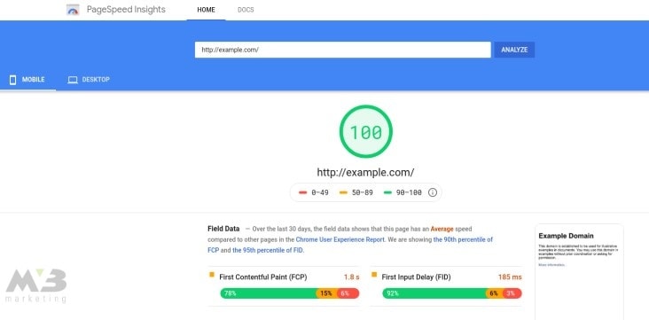
Site speed will vary based upon your server host and a number of other factors. That’s why Google offers a PageSpeed Insights toolkit that can help you better understand why your website is slow to load.
When using PageSpeed Insight, input your site’s URL and let the algorithm within spit out your site’s speed rating.

Note: you want your site to hit 80 at a minimum. Scores of 80 and above indicate that your platform will load within 2 seconds, preventing consumer bounces. Lower scores indicate that your site requires more time to load and that you’re more likely to lose your audience.
PageSpeed will outline the elements of your site that are slowing your load speed in red below your score, so you can fix them.
One of the easiest ways to speed up your site’s download time is to compress your images and HTTP. The metadata included in these elements isn’t necessary to make them appear on your platform, so getting rid of it will optimize your site’s functionality.
WordPress offers WP Smush along with other plugins, which, upon their integration into your platform, will compress your images for you.
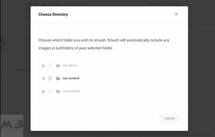
If you operate on a different platform, the free-standing sites TinyPNG and CompressImage can get the job done.
Technical SEO Secrets # 2. Mix ‘Em Up
You should also use sprites (small, pixelated icons) to combine your images. You can either integrate sprites into your platform manually or use an online sprite creator to combine navigation icons or logos.
Piskel and CodeAndWeb both help you make a sprite sheet in no time at all for little to no cost.

Technical SEO Secrets #3. Compress Your HTTP
You need to compress your HTTP. GZIP compression will rid your HTTP of unnecessary metadata, and your site won’t look any less authoritative for the effort. You’ll have to compress your HTTP manually, but you can use any of the following text types:
- GZIP
- XML
- JSON
- News Feed
- HTML Components, or HTC
- Plain Text
- Robots.txt
Two examples of HTTP compressing include:
- Accept-Encoding: gzip, deflate
- Content-Encoding: gzip
Create Mobile-friendly Images
With compression out of the way, you’ll need to ensure that your images and files are mobile compatible.
Google drives 96 percent of all mobile search traffic. With 48 percent of users using search engines to do their mobile research, your platform needs to be accessible via cell phone.
Technical SEO Secrets # 4. Use Google’s Checker Tool
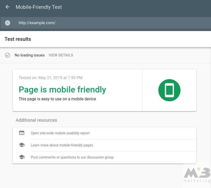
You’ll need to check your site’s mobile compatibility with Google’s mobile-friendly checker tool.
Enter your URL into the tool’s search bar. After you’ve clicked “Test URL,” Google will display your site’s mobile usability in clear terms, either stating that no usability errors were detected or outlining the site elements that your average cell phone won’t be able to process.

Improve Mobile Compatibility
The most common errors you’ll run into are:
- Blocked image files, JavaScript, or CSS
- Unplayable content
- Failed redirects
- Mobile 404s
- Pop-ups
- Slow load times
Technical SEO Secrets #5. Resize Blocked Files
If your images or other architectural elements aren’t appearing on a consumer’s mobile browser, then you may be experiencing an issue with the size of your content. The easiest way to fix this is to code an auto-adjust into your platform that’ll resize your images and other elements to fit a mobile screen.
You can code this resizing for images as follows:
img {
width: auto ;
max-width: 100% ;
height: auto ;
}
Alternatively, you may need to ensure that Google’s crawlers can process your JavaScript or CSS. Use its URL Inspection Tool to understand how crawlers view your content. This tool will also offer you individualized solutions that’ll improve your image processing.
Technical SEO Secrets #6. Modify the Files of Unplayable Content
If Google’s Mobile Friendliness Checker reveals that some of your content is unplayable, you may need to switch the standard tags you’re using for your videos. Flash is no longer the primary tag for most online video media. Instead, make sure that your videos are HTML5 compatible via Google Web Designer.
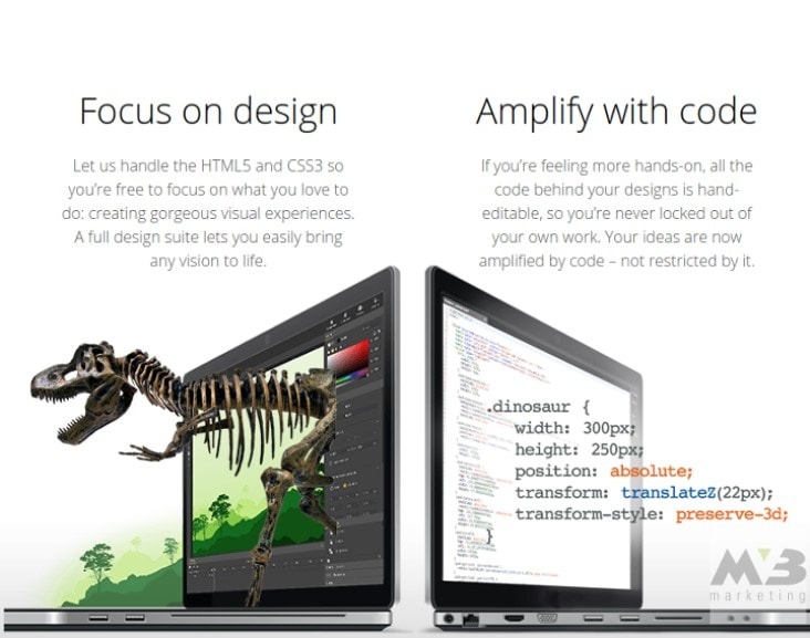
Create a new, blank file in Google Web Designer. You’ll be prompted to choose the format for your file: HTML, CSS, JavaScript, XML, or Google Ads. If you’re animating an advertisement, you can use Google’s HTML5 save file to make that content mobile compatible.
Technical SEO Secrets #7. Re-network Failed Redirects and Mobile 404s
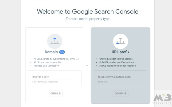
Google will also alert you if you have any failed mobile redirects or mobile 404s on your platform. If you have either, you’ll be able to use Google’s Search Console to locate the missed link and properly associate it with its smartphone match.
1. Log in to your Google account
2. Through Google Search Console, click on “Crawl Errors,” under the diagnostics tag
3. Click “not found”
With that, you’ve found the dead links and mobile 404s on your platform. You then need to edit those links manually using ctrl+k or the control panel accessed via your right mousepad.
If one of your desktop pages doesn’t have a comparable smartphone page, then don’t allow users to click on it. Instead, have that link redirect to your home page.
Technical SEO Secrets #8. Reorganize Your Pop-ups
While you may be making money from having advertisers on your platform or trying to better interact with consumers who come to your site, pop-ups are a no-go on mobile-friendly platforms. To remove pop-ups from your mobile site, you can once again turn to Google.
Google Ad Experience Report elaborates on the site layout of the advertisements on your desktop and lets you see how you can better integrate these ads on a mobile platform.
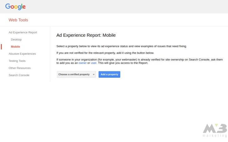
1. Visit Google’s Ad Experience Report.
2. Under “Ad Experience,” select either Desktop or Mobile to review a report for your site on both platforms.
3. Your site will be reviewed, and you’ll receive a rating. “Failing” means that you need to reorganize the advertisement structure on your platform.
Google Ad Experience Report will address the troubling ads on your platform, naming them in its final report. You need to click on “view examples” in the “what we found” column to identify the dialog box with your ad’s description and page URL.
Technical SEO Secrets # 9. Integrate Responsive Design
“Responsive design” refers to platform settings that allow your platform to respond to a user’s chosen method of viewing by shrinking or expanding the content in question. You can program responsive design into your CSS by neglecting pixel measurements and instead utilizing percentages. For example:
body {
width: 40%;
}
Given the code above, the body of a piece of content on your site will shrink to take up 40 percent of a visitor’s screen, regardless of what mode he or she is using. You need to know basic CSS to take advantage of Responsive Design.
Organize Your Data
Once you’ve improved your mobile compatibility, you can better organize your platform’s content to make it simpler for Google or another search engine’s crawlers to read. Content with significant amounts of metadata or with numerous sections can be confusing for a search engine to process and index.
If you use a schema, you can better describe your content to a search engine and improve your SERP.
Technical SEO Secrets #10. Apply Content Schemas
A schema is a CSS term that you integrate into your content to better translate what you’ve written into a language that crawlers can speak.
The more diverse and accurate your schemas are, the better your content snippets will be. With stronger snippets comes a stronger SERP ranking.
Schemas and snippets blur the line of technical SEO, but because schemas are integral to the unseen parts of a web page, they’re still considered exterior to the content itself.
There are hundreds of schema terms available to use. You can find them in this list of terms.
Technical SEO Secrets #11. Markup with Google
Alternatively, Google Markup makes it easy to understand the process of structuring your content.
All you need to do is input your content into Google Markup’s interface. Then, highlight the section of text you want to optimize.

Google Markup will offer you a variety of schema terms to consider. Once you’ve found the one you like, you can click on it, and Markup will do your coding for you.
Once the process is complete, you can manually copy and paste your content into your original platform, or download it.
After you’re finished, give your code a test in a structured data testing tool.
If you’re using WordPress to house your platform, you can use the site’s many plugins to do the same work as Google Markups. WordPress’ schema plugins include:
Need More Help? Optimize Technical SEO with MV3
Do you want to optimize your technical SEO to the best it can be? Hire MV3’s team to help you structure your schemas, improve your site’s speed, and compress your various off-page elements.
We’ll help you escalate your business’ growth—and we’ll make it look easy.
Conclusion
Is your company in need of help? MV3
Marketing Agency has numerous Marketing experts ready to
assist you. Contact MV3 Marketing to
jump-start your business.


